Opal Stands
Opal Stands vs Velvet Display Stands: A Practical Comparison for UK Retailers
Two jewellers on the same high street can stock near-identical rings and still feel completely different to walk into. Often the difference is the stand. One puts a diamond solitaire on a black velvet ring pad, the other on a milky opal-white riser that seems to catch the light from underneath. Both sell. But each material flatters some pieces and quietly works against others, and the wrong choice shows up in cleaning time and in photographs long after the refit is finished.
What Counts as an Opal Stand, and What Counts as Velvet
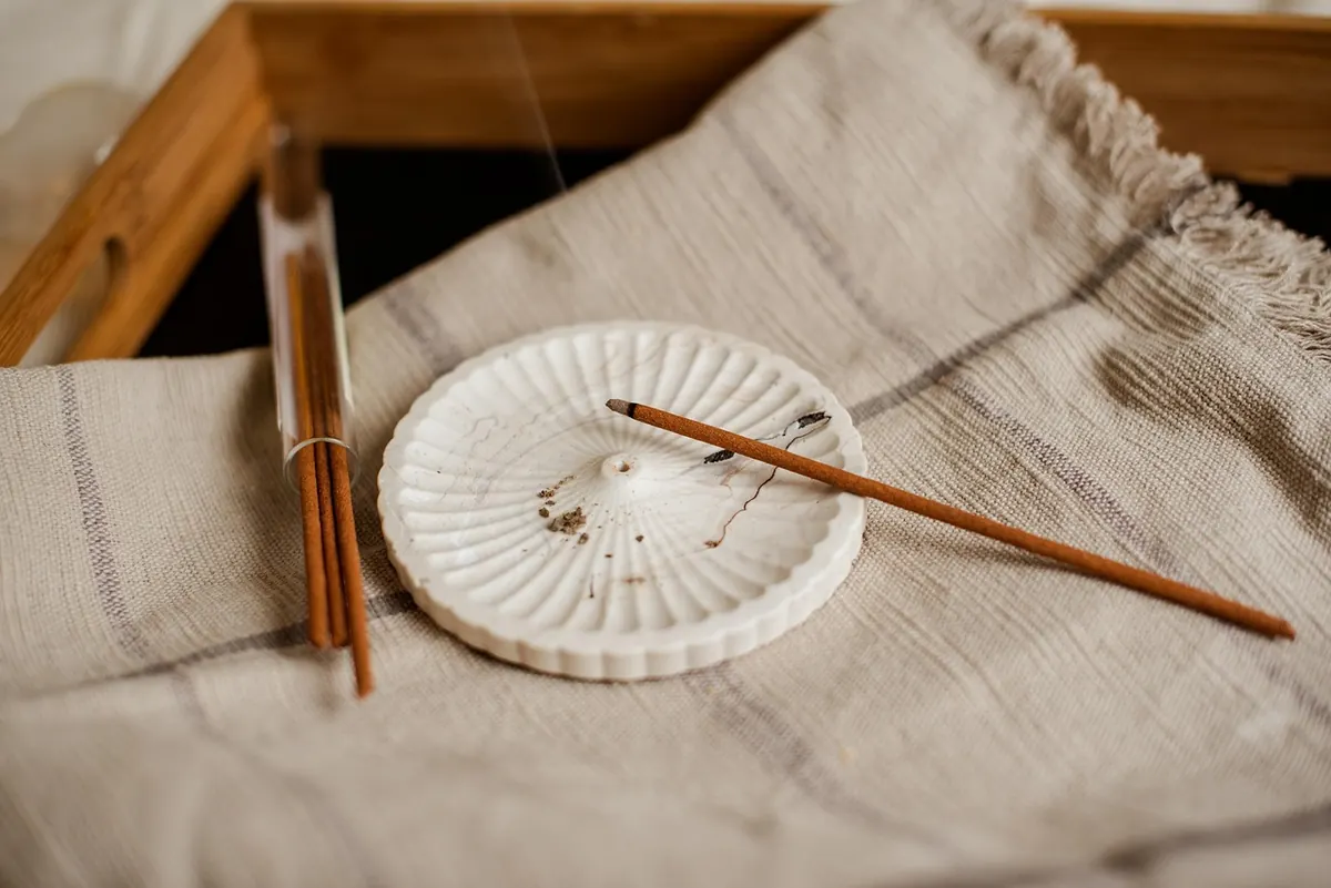
Opal stands are generally made from opal acrylic, a translucent, milky-white sheet that diffuses light rather than blocking it. You will also see resin and coated composite versions, but the visual signature is consistent: a soft, luminous white that shifts as the light moves and the customer leans in. The material is cut, folded or moulded into risers, stepped platforms, necklace busts, ring bars and earring blocks, and takes engraving well if you want a logo or a price recess.
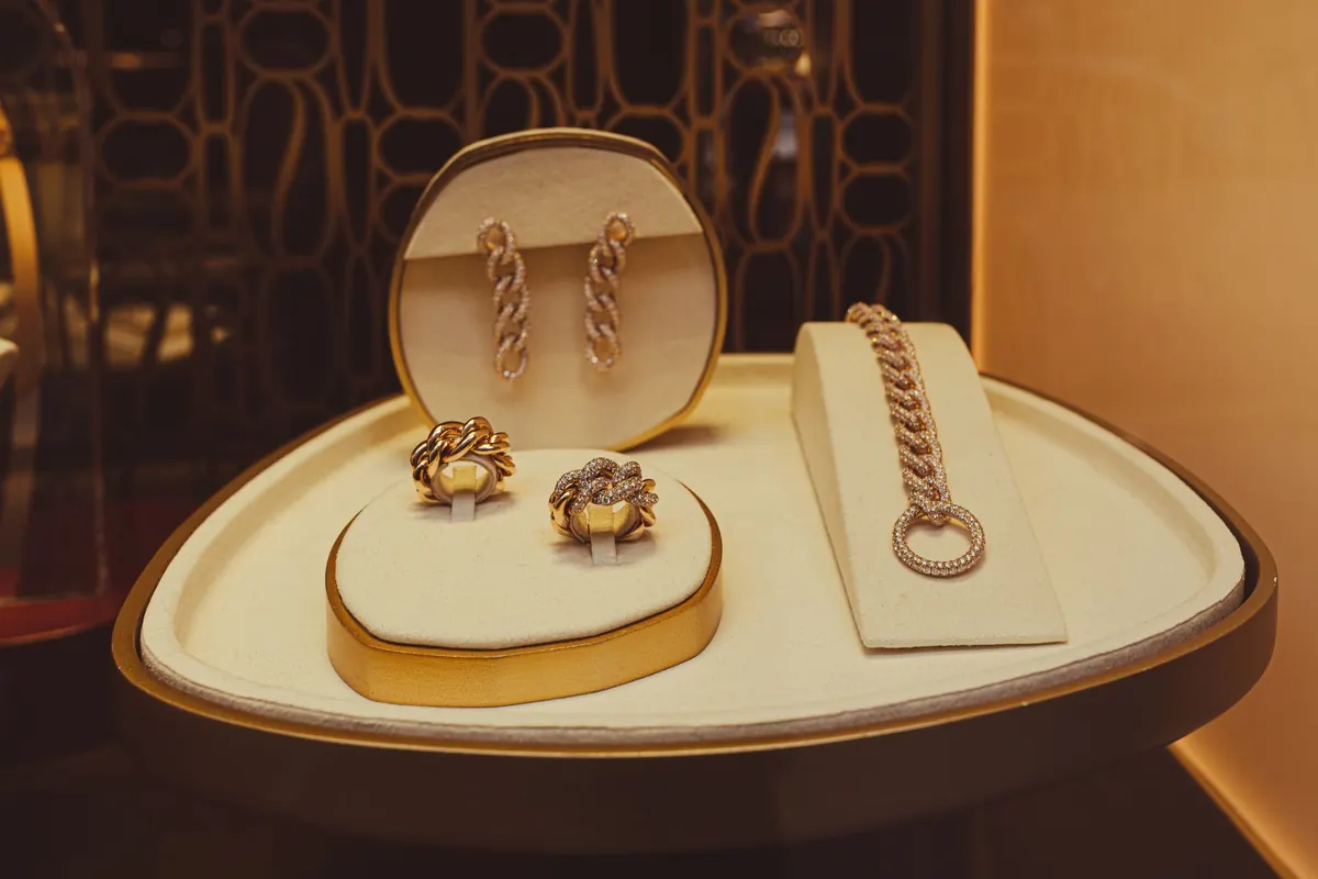
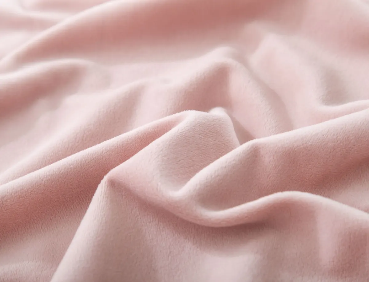
Velvet stands take the opposite approach. A velvet display stand is a rigid core, usually board, foam, timber or metal, covered in flocked or woven fabric. The pile is short and dense, which gives velvet its depth of colour: black reads properly black, and burgundy or navy look rich rather than flat. Velvet also has a slight grip, so rings and loose chains stay where you put them. That small practical detail matters more than most people expect on a busy Saturday.
Appearance: Bright Panel or Dark Backdrop
The whole comparison comes down to how each material treats light. Opal acrylic bounces and diffuses it. Velvet absorbs it. Everything else follows from that.
On an opal stand, the stand is part of the display. A yellow gold chain on an opal riser sits on a bright field, which warms the metal and makes the curve of each link easier to read. The trade-off is contrast. Against a bright white surface, silver and platinum can look slightly grey, and a colourless diamond can lose its outline because there is nothing darker behind it to define the edges.
Velvet does the reverse. A dark backdrop removes competition, so polished metal, diamonds and coloured stones stand out with very little effort. That is why a single emerald on black velvet looks like an event. The same emerald on a bright opal riser is still beautiful, but it has to work harder. Be careful with dark stones on dark velvet, though. Black onyx, dark sapphire and oxidised silver can disappear into the background entirely, especially in a cabinet with low light levels.
Lighting, Cabinets and Photography
Opal acrylic glows under LED strip lighting, and its edges pick up highlights, which means a lit case tends to look brighter overall with less fitting. It also transmits a little light, so a backlit shelf behind an opal riser can produce a gentle halo that draws the eye from across the shop. In a window display, that reach matters.
Velvet needs more directed light. Spot fittings should aim at the jewellery rather than the shelf, because the fabric will soak up anything that falls on it. In return you get depth of colour and a look that most customers still associate with fine jewellery.
For product photography, opal gives clean, bright backgrounds that are easy to work with for online listings, though white stones can blow out against them. Velvet photographs with real depth but is awkward to light evenly, and every speck shows. Whichever you use, keep a lint roller and a soft brush within reach of the photograph bench.
Cleaning, Wear and Day-to-Day Handling
Both materials need attention, but they punish different mistakes.
- Opal acrylic: wipe with a microfibre cloth and a mild soapy solution, then dry. Avoid alcohol-based cleaners, abrasive creams and paper towels, all of which dull the surface. Acrylic scratches, so lift stands rather than sliding them across a glass shelf.
- Static and dust: some opal acrylic attracts dust through static. A soft antistatic brush once a week is quicker than polishing the whole case.
- Velvet: brush in one direction with a soft clothes brush, and use a lint roller on flat pads. Blot spills immediately with a dry cloth. Do not rub, and avoid damp cloths, which flatten the pile and leave marks that are very hard to lift.
- Deeper cleaning: vacuum velvet with a brush attachment on low suction. Rotate stands regularly so the pile does not flatten in one spot at the front of the case.
- Replacements: velvet goes bald at corners and edges with handling. Keep spare pads and small risers in the stockroom rather than reordering in December.
Opal, handled sensibly, will last through several refits. Velvet looks better on day one and needs more care by year three.
Matching Stands to Jewellery
There is no single correct answer, but the pattern is fairly reliable:
- Diamonds, platinum and white gold: dark velvet, for contrast and perceived value.
- Yellow gold: opal white warms it; black velvet gives it drama. Choose by the rest of the case.
- Coloured gemstones: velvet for saturated stones, opal for paler ones such as aquamarine or morganite.
- Pearls: soft neutrals work best. Bright white can dull a creamy pearl, so consider an opal stand with a mid-tone or grey insert.
- Oxidised silver, onyx and dark stones: opal or a light background so the piece does not vanish.
- Watches: opal risers for clean, modern lines; velvet cushions for higher price points.
- Earrings and small pieces: velvet pads for grip, opal steps for height and tidiness.
- Window displays: opal for glow at distance, velvet for close-up detail.
Mixing the Two Without Cluttering the Case
Most successful cases use one material as the structure and the other as the accent. Opal risers and platforms hold the height and shape; velvet pads and ring inserts hold the pieces. That gives you the brightness of one and the contrast of the other without the case looking like two shops pushed together.
Keep the fabric colour count low, ideally one per case, and keep the metal fixings consistent. If you sell online, reserve velvet for the pieces you photograph most often, so the retouching load stays manageable.
Choosing for Your Shop
Before you order, ask four practical questions. How is the case lit, and can you aim fittings at the pieces? What is the average value of the stock going in? Do you photograph for a website? And how much time can someone realistically give to maintenance each week?
A bright, well-lit modern case with a strong online presence usually leans towards opal. A traditional counter with directed lighting and higher-ticket pieces usually leans towards velvet. If you are unsure, buy one opal riser and one velvet pad, place your best-selling piece on each under your own lighting, and look at them from the customer's side of the counter. That test takes ten minutes and settles the question faster than any catalogue photograph.
Related Articles